Analysing the trend over time of GiftEval time series benchmark
The topic about benchmarking often comes up in forecasting as it has lots of important and tricky dimensions: which dataset, which metric, which baseline, which cross-validation procedure, …
For the amount of datasets, different papers have different standard. For instance a set of 4/5 datasets are still used in some papers today. I do think that larger collection of datasets are important with standard, shared and reproducible workflows.
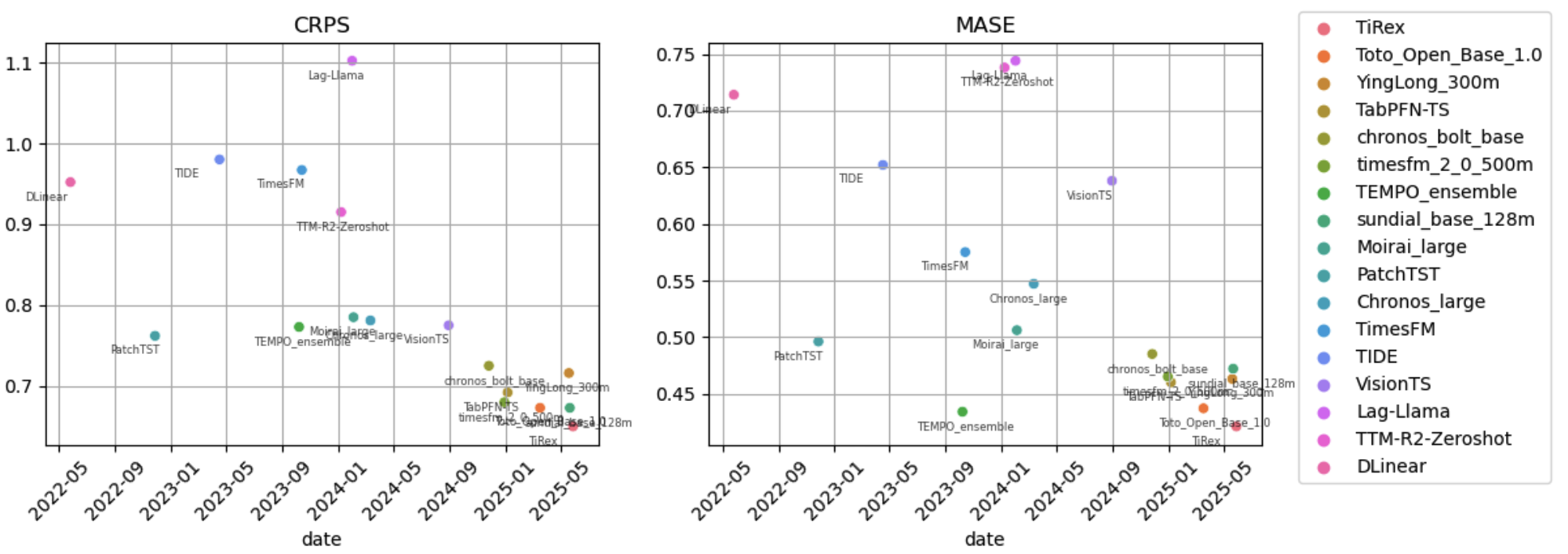
In this sense, GiftEval from Taha İbrahim Aksu et al and Salesforce is a great contribution. It is not perfect (it could have more datasets perhaps) but is a great start! (and following the steps of previous work like Monash or AutoGluon who collected larger collection of datasets). I was curious to see the progress over time, you can see it in this plot:

It is very much alive with many entries from different institutions. Lots of methods popping up as everyone is racing on improving this shared leaderboard 🏎️. For MASE, the average improvement year over year is -0.07 which is cool (we just need to wait 71 years to get a negative MASE 🙃).
PS: I pushed the notebook in case you want to take a look here. I used LLMs to pull most dates from arxiv (I just checked that they looked roughly correct, feel free to open issue if you spot a mistake!).
PS2: If you are working on tabular evaluations, take a look at TabArena - a shameless plug - but I do hope this living benchmark plays a big role to improve comparisons of tabular methods.
